Javier E. Trujillo reviews the first issue of Dynamite’s newest James Bond thriller, 007!

007 is back in action! After a high-stakes rescue mission is mysteriously, violently sabotaged, James Bond’s future at MI6 hangs in the balance. What is “Myrmidon” and how does it tie in with a former 003?
Writer: Phillip Kennedy Johnson
Artist: Marco Finnegan
Colours: Dearbhla Kelly
Letters: Jeff Eckleberry
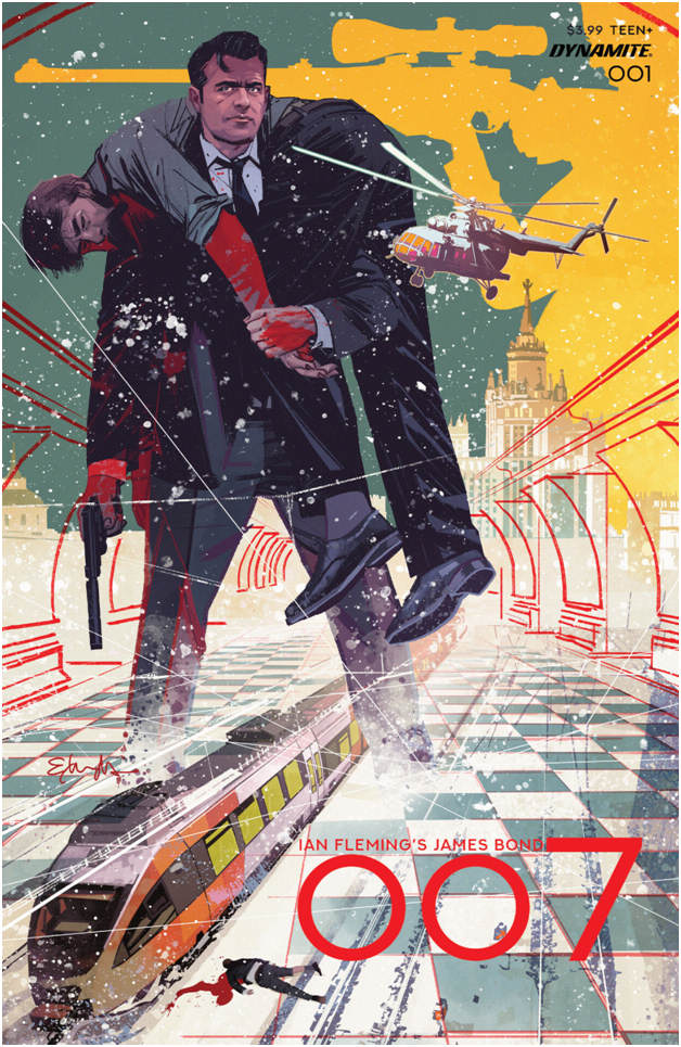
Main Cover: Tommy Lee Edwards
Packager & Editor: Nathan Cosby
Plot
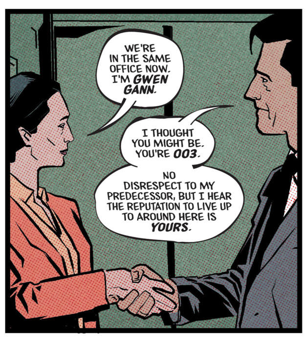
007 is on a mission in Moscow to rescue Fedor Nikolaev. However, a trap has been sprung on Bond and 007 barely escapes with his life, whilst Nikolaev is killed by attackers who are more interested in how Bond performs. Weeks later, Bond is called into M’s office at MI6. M places Bond on leave as the PM wants to hold someone responsible for the mission’s failure, which doesn’t sit well with 007 as he feels he was set up. One week later, Bond gets a phone call from a number he didn’t expect. It’s Gwendolyn Gann, who used to be 003…and Bond’s former mentor. She puts him on the trail of “Project: Myrmidon”.

Opinion
Dynamite has published James Bond (and various mini-series under that title) and James Bond: 007, now it is time for 007!
Taking up the pen is current Action Comics scribe Phillip Kennedy Johnson, who was formerly a Sergeant First Class in the United States Army, a career that hopefully can give him some insight into the world’s most famous spy. He’s brought a fresh voice to the Man of Steel, leaving many hopeful he could do the same for Bond.
His first entry is a solid one. The character of Bond is the focus, which has been lacking in some prior first issues. The story starts off with some tense action, leaving room for character development in the back half. Johnson also peppers in flashbacks, establishing 007’s past relationship with Gann. It’s a well-rounded first issue, with plenty to pay attention to, particularly due to the aforementioned flashbacks and how they are woven in with events in the present day.
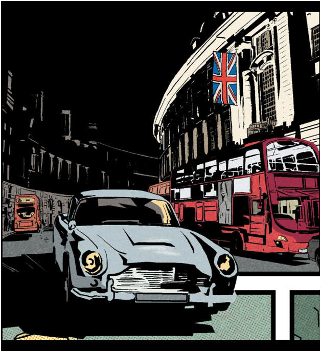
As good as the writing is, the visuals are a mixed bag for me. Artist Marco Finnegan’s work is a step up from Pontrelli’s contribution in Himeros. There is a roughness and simplicity at times, making it feel rushed and unfinished. Despite that, I feel his layouts are strong, just unpolished. Panel construction is varied and there’s a shot of the DB5 that I love!
Dearbhla Kelly is vital on the colours. From the grey of Moscow to the harsh fluorescence of office lights, you are placed in the world. Modern settings continue to have almost a construction paper texture to the colours, while the flashbacks are easily recognized by the presence of Ben-Day dots, a nod to the printing style of old. As the story shifts time periods often several times on the same page, this technique is imperative in following along as to where the setting is.
There’s usually not a lot to say when it comes to lettering, but I wasn’t a fan of how speech balloons were worked in. I’m not sure if this can be laid at Jeff Eckleberry’s feet, but they had an uneven appearance, almost as if they were carelessly constructed. It added to the rushed feeling of the art.
Story-wise, I feel 007 is in good hands under PKJ. I appreciate the complexity he is bringing to the tale and insight into Bond’s early days as 007. I just wish this book had some stronger art to pair alongside it. Regardless, I’m eager to see where this goes!

Buy online


