Javier E Trujillo looks back at the teaser posters from the Daniel Craig era.
5 October 2019 once again commemorated Global James Bond Day. Whilst many fans were eager for EON to release a teaser trailer for the upcoming 25th film, No Time to Die, it was not meant to be. Instead, @007 revealed the first poster. For this Bond fan, the release of the upcoming movie’s official marketing has always held a great deal of excitement.
Trailers and posters are a perfect time capsule of the moment a new 007 thriller is released and show off the sensibilities of the era, for ill or good. Bond posters have evolved a great deal since the days of one-sheets graced by artwork of Robert McGinnis and I thought we’d take a look back at the teaser posters from the Daniel Craig era, now that it is seemingly nearing its end.
Casino Royale
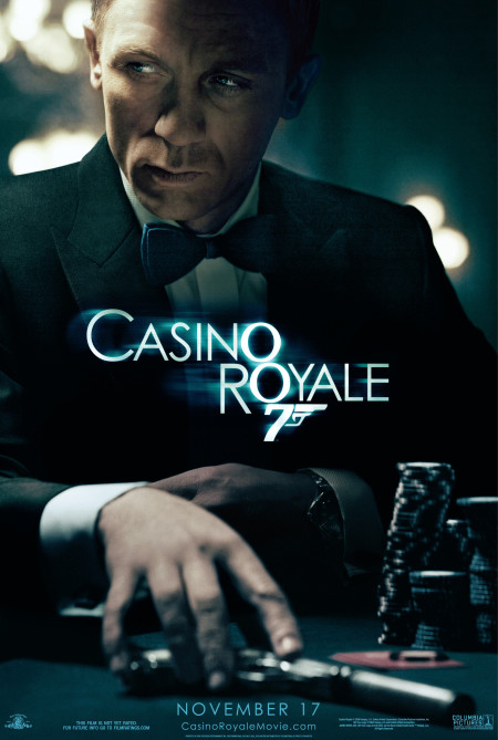
2006’s Casino Royale teaser poster is the very essence of Bond, evocative of when we were first introduced to Sean Connery in Dr No. A tuxedo clad Daniel Craig is sitting at a poker table, chips stacked high, his silenced Walther within reach.
You can imagine Craig’s Bond is scanning the room for threats as his hand begins to coil around his Walther. Bond is half in light, half in shadow, lending to a film noir feel.
The physical poster is a glossy affair, helping to accentuate the shadows and add a nice sheen to how the image was lit. 007 is also brandishing his now cinematic-signature Omega.
This is a great way to introduce audiences to a new James Bond, especially as Texas Hold ‘Em Poker was sweeping the airwaves. It’s my favourite Craig poster.
Quantum of Solace
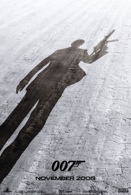
Quantum of Solace was released in 2008 and saw two teaser posters. The first offered a downwards glace at cracked earth, adorned only by the shape of Bond’s shadow.
This same ground seems to make an appearance in the teaser trailer, only with a 007 logo in silhouette. 007’s suit jacket seems to be fluttering as he hoists a very large gun. It does not show off the elegance of Bond’s world, but does call to mind the ending of Casino Royale. It’s serviceable, but does not get the blood pumping quite like the Casino Royale poster.
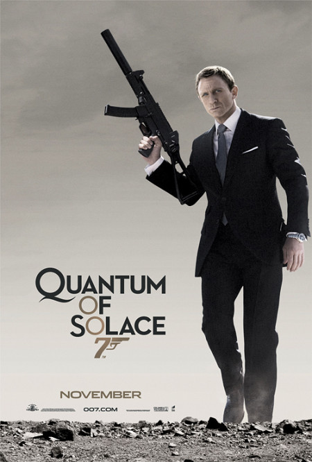
The second poster is a slightly more revealing affair, showcasing James Bond walking towards the camera, armed with the same gun from the prior poster. The earth is rocky and barren and also like the last poster, this image, too, seems to be featured in the actual trailer.
007 is sharply attired, decked out in Tom Ford and what appears to be an Omega Planet Ocean. Bond looks like he means business. This same image is also used for the video game. Of the two teasers for this movie, I would go with this one to frame on a wall. Unfortunately, a shipping error meant I never received my print and I still need to go order another. I definitely recall seeing this for the first time at the local multiplex and feeling the wave of excitement I get when something new from Bond shows up, but it, too, doesn’t quite feel magnificent enough.
Skyfall
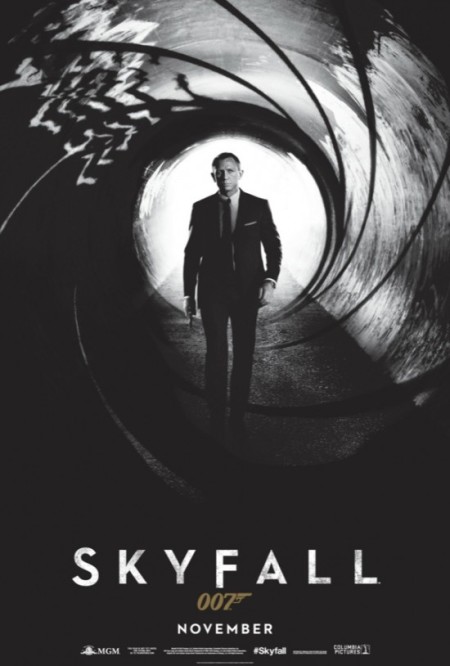
May 2012 brought the release of the first Skyfall teaser poster. It’s more striking than the images we got with the Quantum of Solace campaign. Drenched in blackness, Bond is striding forward down a tunnel that is merged with the iconic opening gun barrel.
Having the gun barrel as the teaser poster is a great callback to the first twenty movies in which it was amongst the initial images an audience would see. Granted, some would say Bond should not be walking down a tunnel coming out of the barrel, but I felt it was more Bondian than what we saw with the last film and, unfortunately, what’s to come. The 007 logo is gold this time out, signifying the 50th anniversary.
Here in the United States, I never saw the Skyfall character posters in a cinema lobby and I’m not sure if that is a good or bad thing. Like the final US poster, it featured a singular character against a stark white background. Many a fan was dismayed that this was chosen to represent the celebration of fifty years of cinematic 007, myself included. Die Another Day, celebrating Bond’s 40th, went a similar route, but at least they added some effects to the blue background.
There was also a special IMAX poster for the midnight release that whilst devoid of most colour, surrounds Bond with the necessary iconography of London, the Aston Martin DB5, a Walther PPK, and an Omega Aqua Terra watch. It is much preferred by me to Bond lying in the dirt in front of a white background. It was a disappointing campaign for a movie marking a half-century of adventures.
SPECTRE
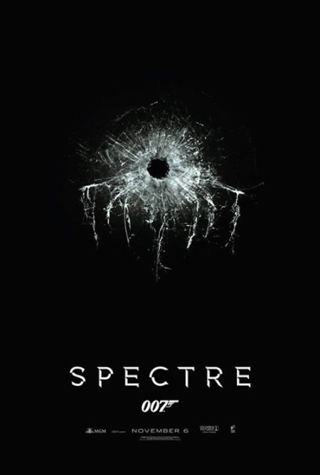
The title for the 24th EON produced Bond movie, SPECTRE, was revealed alongside a tantalizing image of a bullet hole in glass with the cracks forming many dangling tentacles in December of 2014. Obviously, the shape is meant to pay homage to the old logo of SPECTRE, but the bullet hole is also evocative of the shattered windshield from when 007’s wife was murdered by SPECTRE’s chief operatives. It’s simplistic, like a good teaser should be, and definitely whets one’s appetite for more.
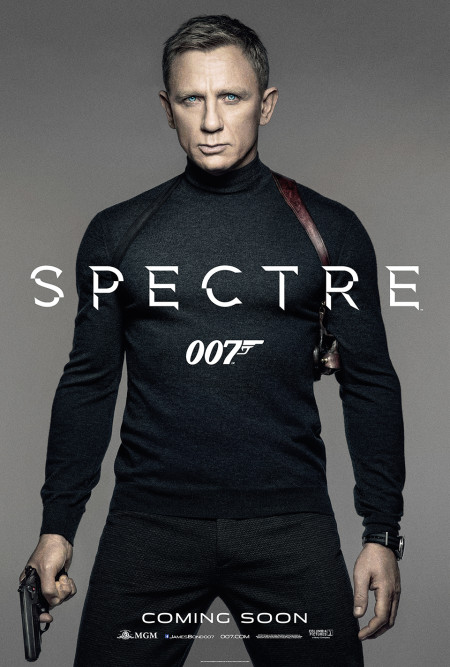
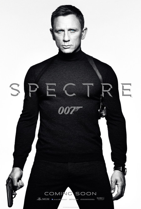
The next teasers we shall cover today were released 17 March 2015 and basically consist of one image, but with two variants of different hues and shapes. Released in standard one sheet and quad formats, 007 is once again in front of a void, either in grey or white depending on which version you run across. I approve of the outfit as it’s meant to evoke either Live and Let Die or Steve McQueen in Bullitt, but the lack of background makes it look like a modeling advertisement, not a movie poster. Craig is once again clad in an Omega Seamaster, this time adorned with a NATO strap, calling to mind the pre-title sequence of Goldfinger.
No Time to Die
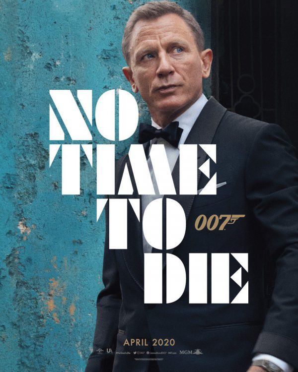
Finally, we reach No Time to Die. Photographed by the magnificent Greg Williams, veteran of several Bond on Set books, 007 is obscured by the title, whose font has graced many an influencer’s Instagram avatar since its reveal. Bond himself is adorned in a Tom Ford tuxedo and Omega Seamaster in front of a weathered blue wall, staring off at…something. Presumably, whatever that something is will be revealed in April 2020, but the overall effect hit the Bond Community with a resounding “meh” amid cries of it not being something one would frame and display in their collection.
If this is to be Craig’s last film, I appreciate the elements that bring this image full circle with the Casino Royale poster, but side with those who were hoping for more. The journey from SPECTRE to No Time to Die has been one of great uncertainty from several aspects, which has most likely led to heightened anticipation for some that could be hard to meet. A five year gap is a long wait in today’s culture, especially when you look at the frequency of Bond releases in the 1960s or compare it to the latest comic book franchise that has several movies spread across the year. Still, whether you like the image or not, the poster communicates one very important thing – James Bond has indeed returned!
Whether or not No Time to Die gets character posters as well remains to be seen. What is known is that the posters of the Craig era seem to be getting more minimalistic as time goes by. Whilst I doubt we’ll ever go back to the art style posters that we saw up until The Living Daylights, I do hope the next campaign, whatever form it may take, with whatever actor may wield the Walther, gets more inspired.
Javier E. Trujillo is a lifelong fan of all things Bond. He can be reached at @JaviTru
A previous version of this article was first published on 1st April 2015.


